Your logo is a key element of your visual brand identity, but you might be surprised to learn that many businesses use multiple logo variations. Having up to four versions is common, each designed for specific uses in print and digital media. There's a primary logo, the most prominent one, and then complementary variations that work alongside it. These variations ensure your brand maintains a consistent look and feels adaptable across various touchpoints.
What are logo variations?
Logo variations are simply alternate versions of your logo. They are not very different from each other in terms of style. In fact, the more cohesive they look, the better. The major difference between them is their shape. Each variation is applicable for specific use cases, which we’ll take a look at below.
Four common logo variations
Of course, it’s not necessary to have four logo variations. Some brands have more and some have less. The number really depends on what type of business you have and where you display your logos.
The following are the four most common logo variations that help form a cohesive and versatile visual brand identity. For demonstration purposes, I’ve included examples of the logos I created for one of my branding clients, Verve Social Media Management.
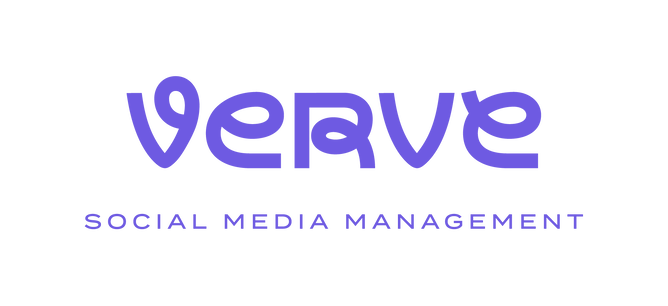
1. Primary logo
Your primary logo is your most complete and complex logo variation. Often, it contains a combination of text (your brand name) and a unique illustration or icon. It may also display a tagline and year of establishment. Primary logos are typically well balanced horizontally and vertically.
The primary logo is the most commonly used logo variation and is best used for large displays, such as website headers, brochures, and signage.
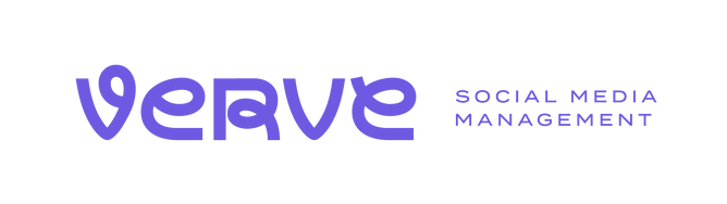
2. Secondary logo
The wide version of the primary logo is often referred to as the horizontal or secondary logo. In order to create a horizontal version of your primary logo, some re-structuring or simplification may be required, for instance, removal of the tagline. In some cases, the horizontal logo is simply a typographic logo with the name of the brand and no other elements.
Secondary logos are perfect for letterheads, email signatures, and social media banners.
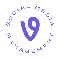
3. Submark
A submark is a condensed and simplified logo variation. Typically, it contains just the brand icon or initials, but there are exceptions. Submarks are generally circular or square shaped.
Submarks are great for small displays where the primary and secondary logos become illegible, such as social media profile pictures, footers, and watermarks.
4. Favicon
A favicon is a tiny icon that sits in the browser tab next to the title of your website. Since it’s so small, it typically contains just the icon from the primary logo. If the logo system doesn’t include an icon, the favicon may instead consist of the brand name initials.

In addition to these layouts, consider having colour variations of your logo. You might need a dark version for light backgrounds, a light version for dark backgrounds, or even black, white, or grayscale versions for specific uses.
By having these variations, you ensure your logo is always recognisable and impactful, no matter where it appears.
Want to learn more about branding design?
At Little Bird Creative, I help bring your brand to life with a strong, polished, and refined visual brand identity. Click here to learn more about branding design.

